A product design case study focused on acquiring new users for a B2C shopping application that reached #11 in the "Safari Extensions" category on the Apple App Store.
Responsibilities
Content design
Visual design
Interaction design
Purpose
Freelance project
Team
Product Designer (myself)
Founder
Developer
Duration
One week
Link to Figma prototype of the solution:

The Product
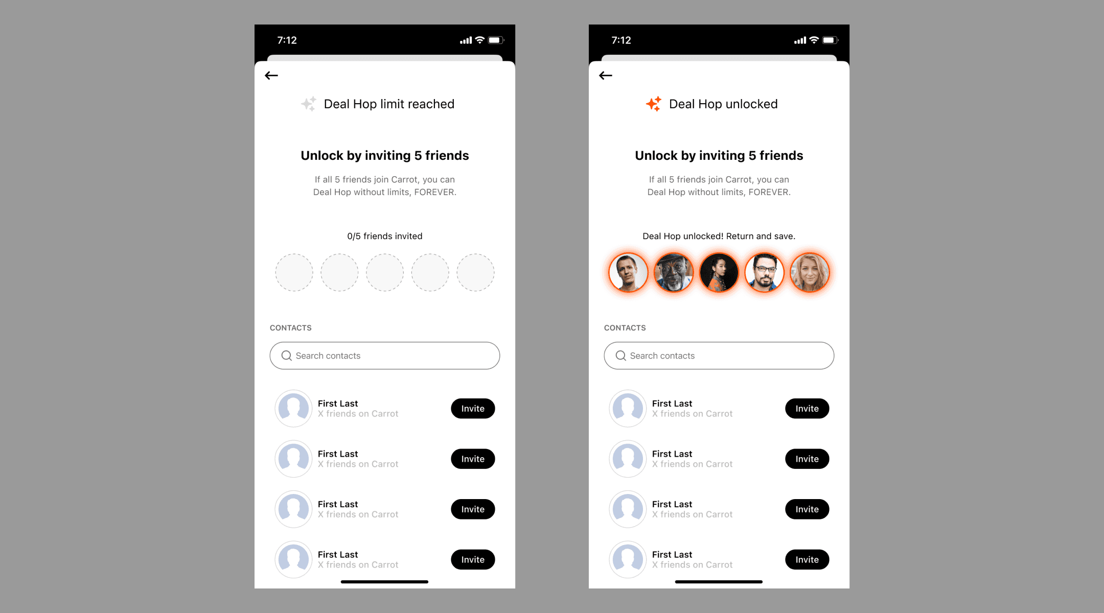
Carrot is a mobile app and browser extension that helps users organize their online shopping and find product deals using its AI feature called “Deal Hop.”
There is also a desktop web app and desktop browser extension. Check out Carrot for yourself here.
Business Problem
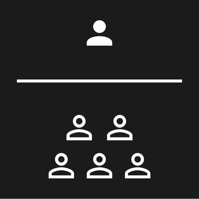
Users aren’t inviting others to join Carrot, resulting in lower growth of new users.
According to the founder's tweet, Carrot has over 150,000 users.
Design Goal
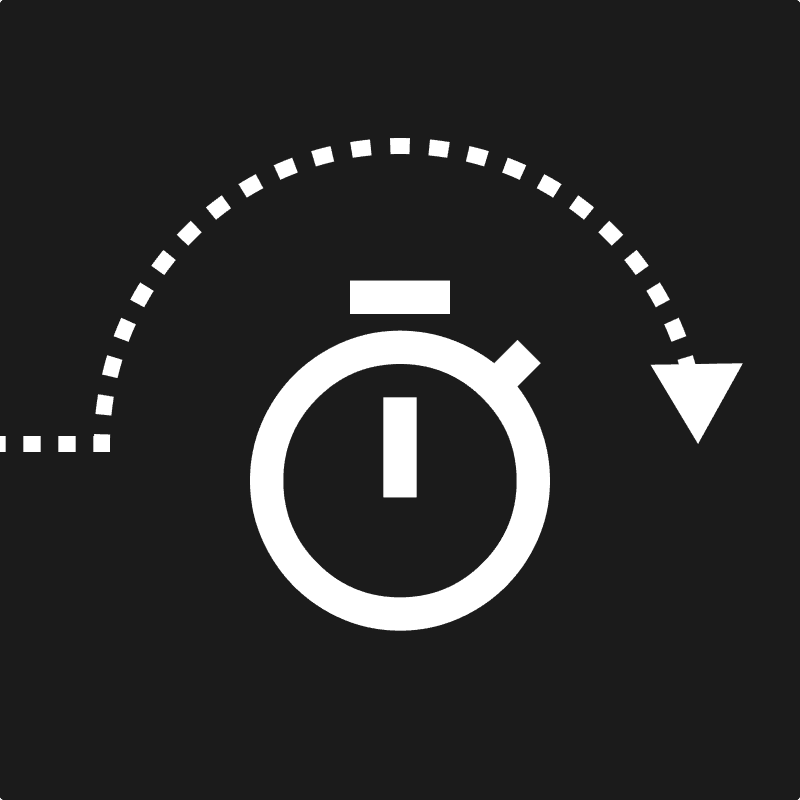
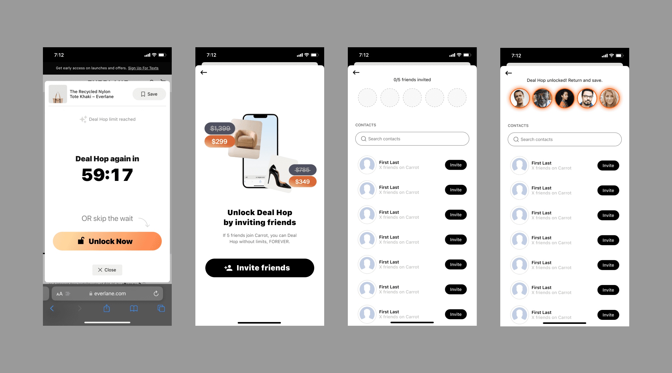
To incentivize users to invite others by limiting the amount of Deal Hops users can have within a duration until they share the app.
The duration length is not confirmed.
Solution
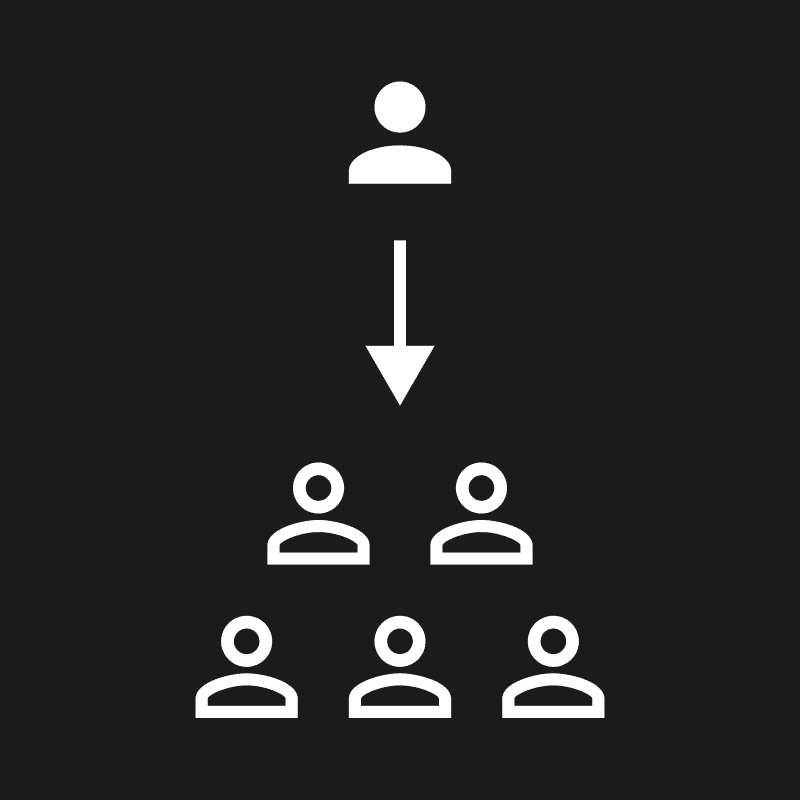
A flow that explains to users the Deal Hop lockout timer and guides them to invite others so they can regain access.

This flow incentivizes users to share Carrot with their friends because it restricts how much they can use the app’s most valuable feature.
Result
According to the founder, the flow increased the amount of new Carrot users.
The specific amount of new users isn't public information.
Process
Hypothesis
If we limit the number of Deal Hops users can do in a given duration, then will they invite others so they can skip the lockout timer?
Research
I referred to social applications for inspiration because they often contain gating patterns as growth strategies.
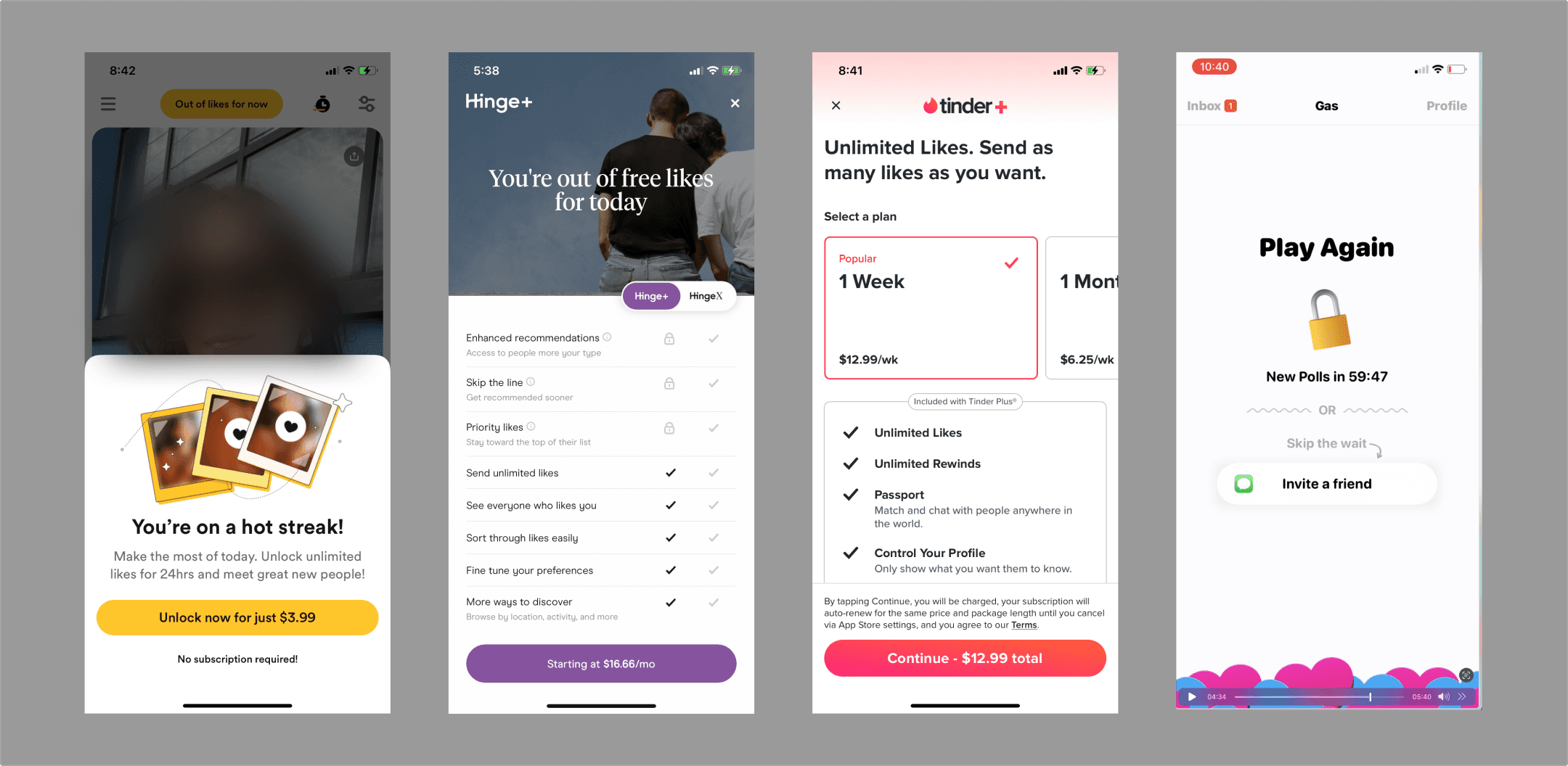
From left to right: Bumble, Hinge, Tinder, and GAS.
I didn’t conduct user research for this project because it wasn’t within scope.
Visual Design
The designs began in hi-fidelity because the founder wanted to move fast.
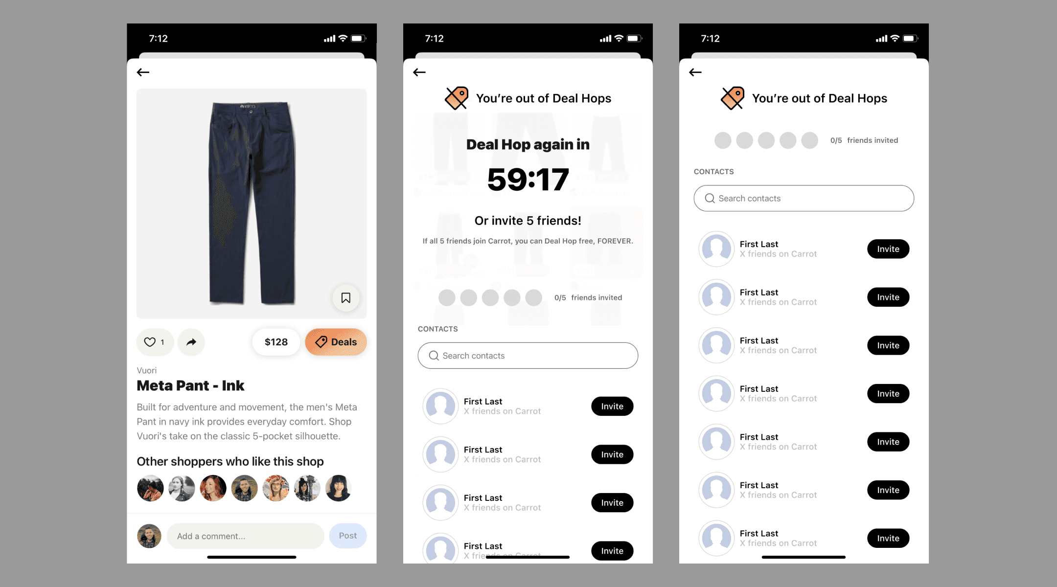
Version 1 - App entry
I accounted for two entry points into the flow: the app and the mobile Safari browser. Carrot has no design system, guide, or UI kit, so I leaned on existing designs for visual cues.
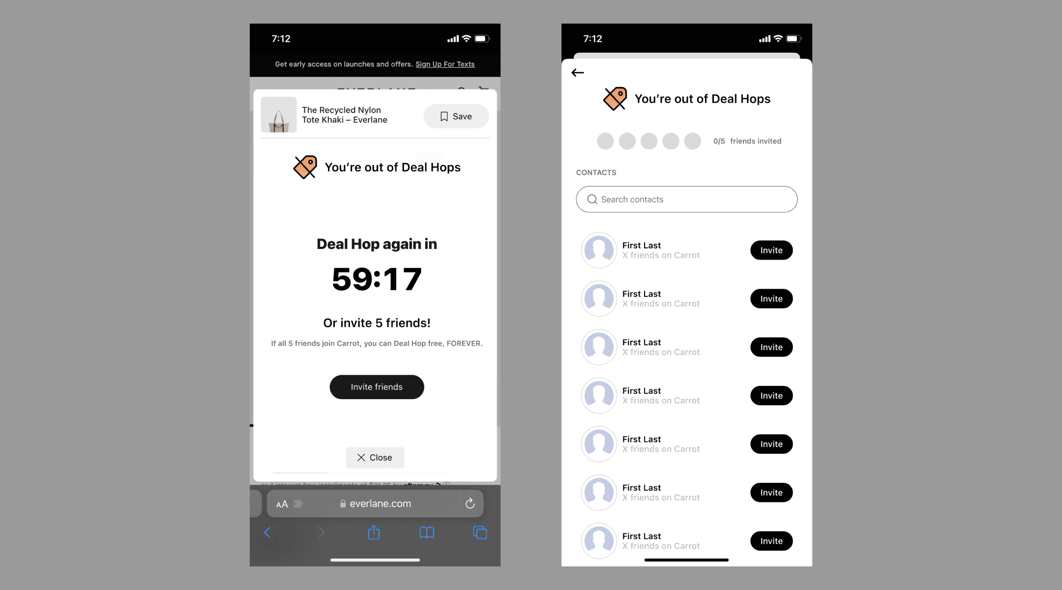
Version 1 - Mobile Safari browser entry
The founder provided thorough feedback on this first design pass that informed the following iterations.
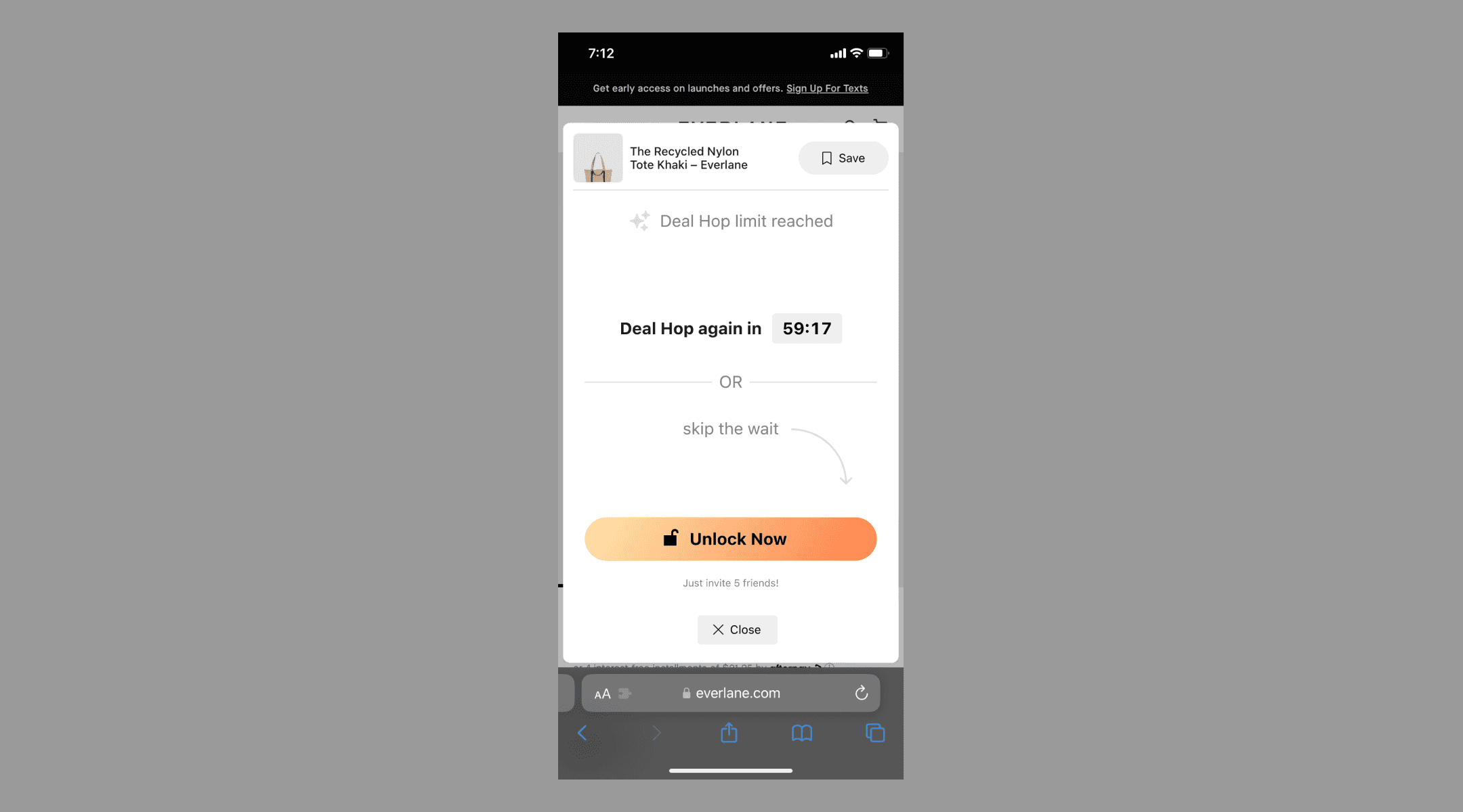
Version 2
Founder feedback: The big timer was more imposing in a good way, and right now, given the similarity in weights, it's hard to understand where the emphasis is.
Version 3
This version had additional copy at the top, but it was removed to reduce clutter.
Version 4
Ultimately, the founder decided against an additional screen in the flow that would explain the requirements

Looking Forward
If I were to take this project further I would finish designing and implementing the onboarding flow.
When this project started, the plan was first to redesign Carrot's onboarding flow and then create the Deal Hop gating flow. I was given one week to make both.
I was told to design the onboarding so that users experience the "aha moment" of Deal Hop within the mobile app in three to five taps.
I spent the first four days of the project redesigning the onboarding. Then, the founder told me that the team wanted to focus on Deal Hop gating instead because it would be easier for the developers to build.
It would be both personally fulfilling and beneficial to Carrot to complete the onboarding redesign part of the project.

Learnings
Some startups move quickly and aren’t afraid to be messy in the process.
Designs might get built differently from what you mocked up and received approval on.
Priorities can change, and work will get tossed or shelved.
When it comes to cross-functional collaboration, communication is the key to success.