Enabling Loom Viewers To Find + Retain Critical Info
A case study about improving workplace communication tools.
Responsibilities
Prototypes
Visual designs
Research
Usability tests
Purpose
Feature proposal
Team
Designer (me)
Duration
12 weeks
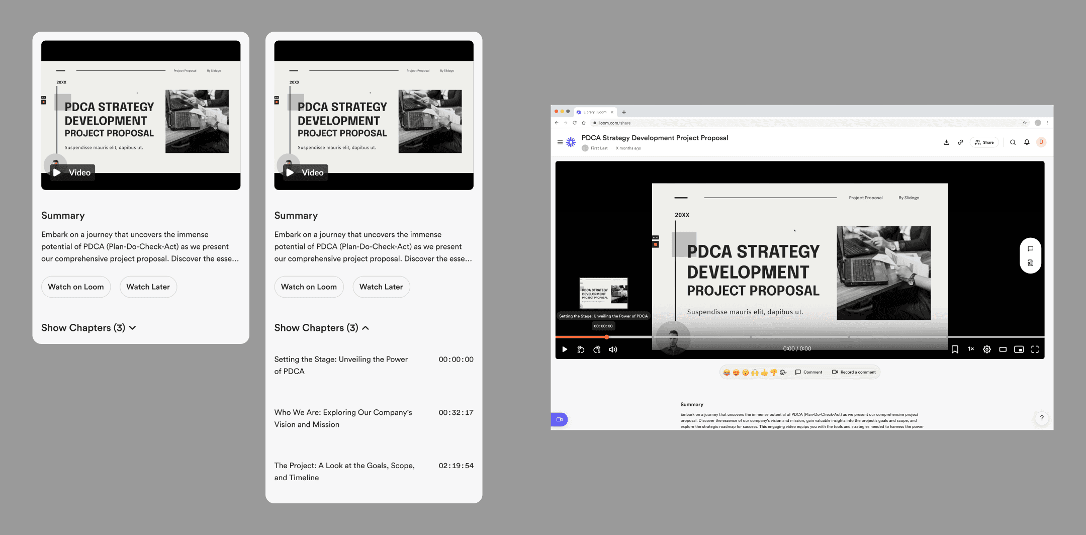
A preview of the solutions.
The Product
Loom lets users simultaneously record themselves and their screens and then share their recordings with coworkers.
The tool is an example of asynchronous communication because it allows interactions without the constraint of real-time conversations.

User Problem
Viewers of long Loom videos miss or lose critical information due to inefficient or ineffective navigation methods.
These methods make video exploration difficult, leading to frustration, miscommunication, and reduced information retention.

Design Goal
To enable viewers to find and retain critical information in Loom videos.
Fulfilling this vision will improve users’ performance at work and increase Loom’s revenue.
Solutions
The designs reduced friction across the Loom ecosystem.
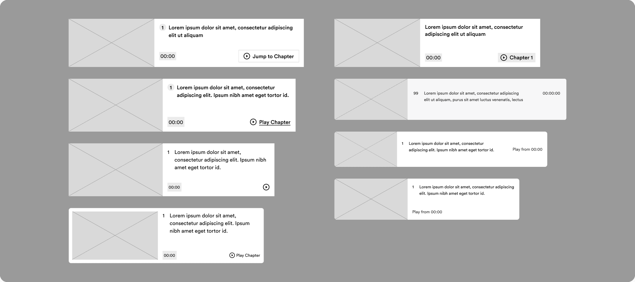
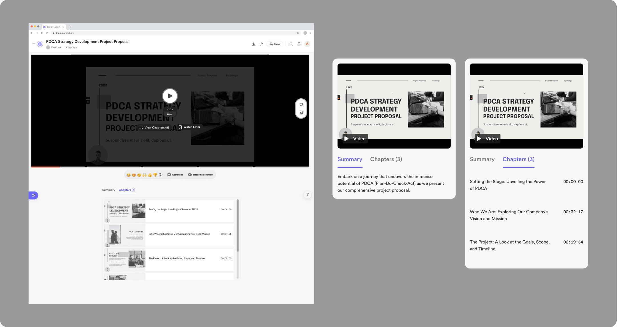
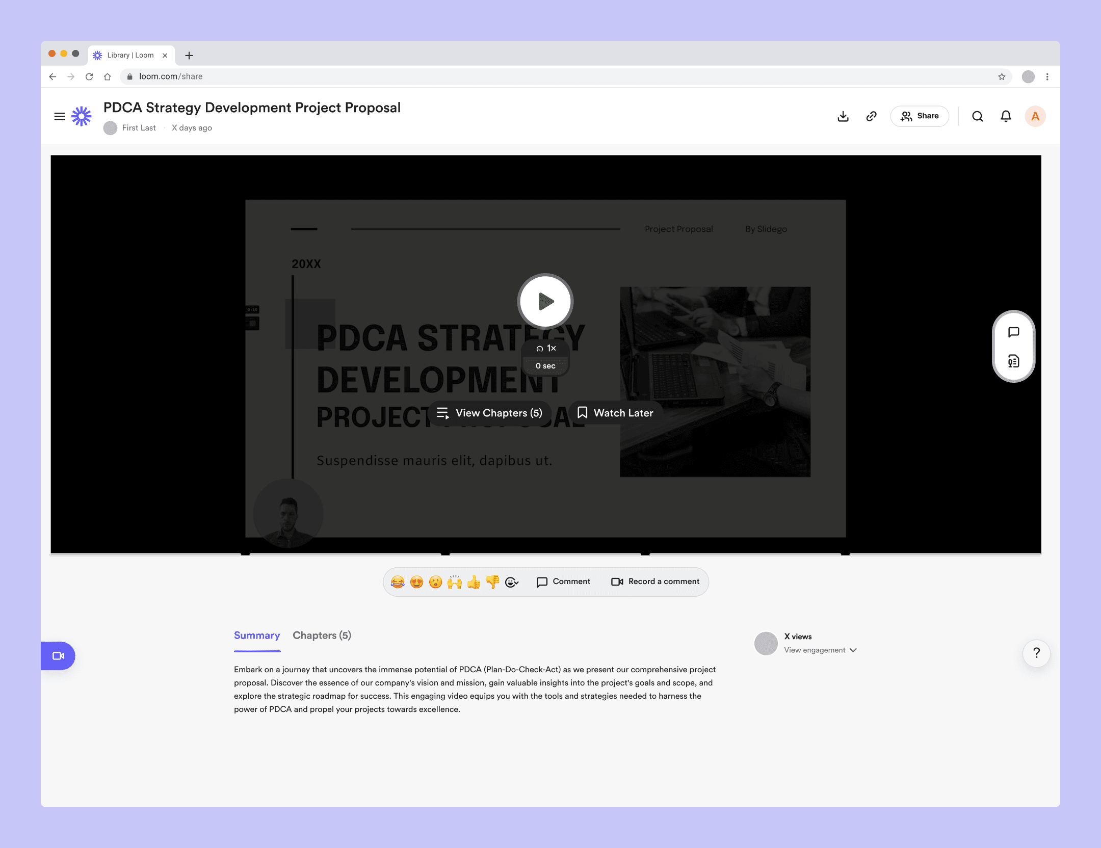
A “View Chapters” Start Option
A noticeable option to select from a chapter list at a video's beginning empowers viewers to find critical information.
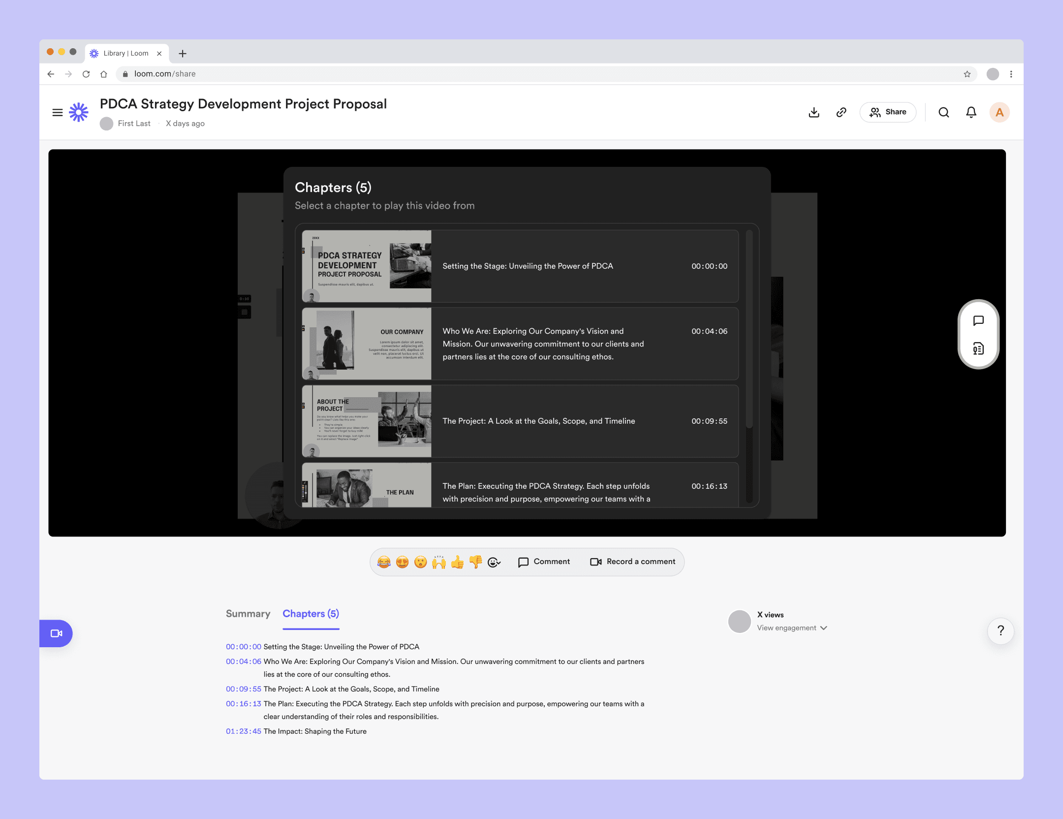
A Visual Chapter List
A conveniently placed list of chapters with associated images clarifies each's information.

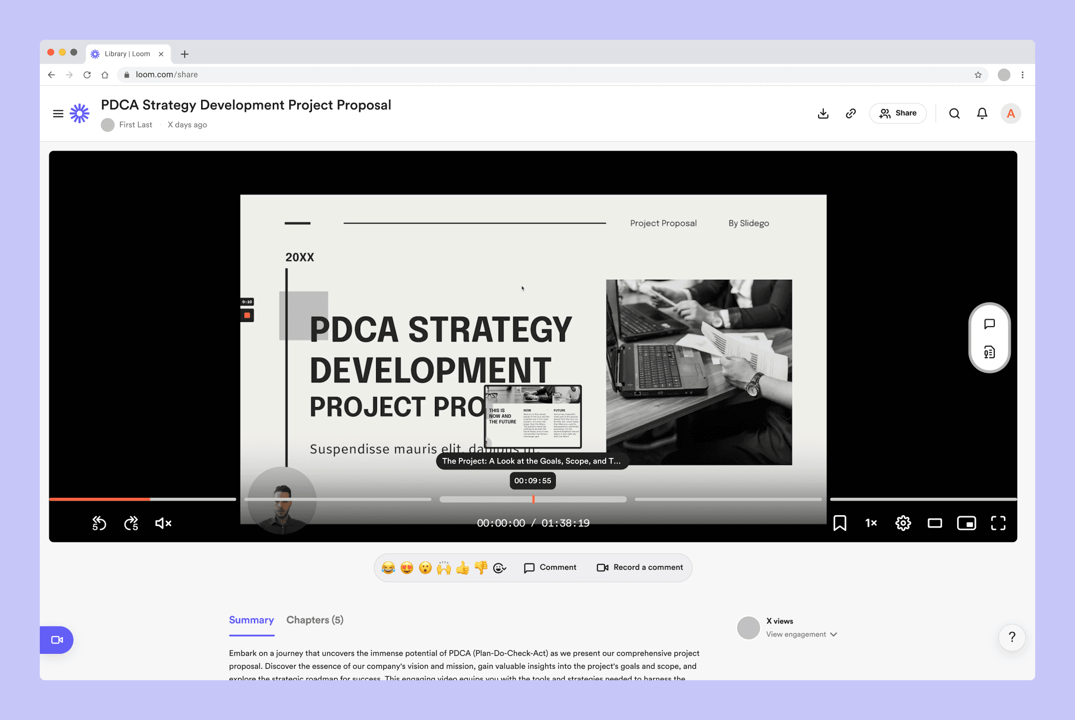
A Visual Preview On The Timeline
Images accompany the text preview for viewers’ comprehension when they hover over a chapter segment.
A “Chapters” Tab
Viewers can discover the persistent chapter section from the top of the web page.
An Accommodating Slack App
Chapters within the Loom Slack App make videos easily understood to encourage recipient viewing.
Slack is an instant messaging platform developed for professional communications. “Apps” connect tools and services with Slack, so you can use them without leaving your workspace.
Links to Figma prototypes of the solutions:

Lengthy Loom videos are like driving on a long dark road without navigation.
You don’t know when you’ll get to your destination, nor what intriguing things you could expect to encounter along your way.

Video chapters guide viewers through the recording so they can find what they need.
Like charting a course on a map, they help them prepare for the journey before they embark.
And like signs on the road, they tell viewers what’s coming soon.
Before
The state of Loom's web page and Slack App was insufficient.
The UI guided viewers to begin playing videos only from the start.
The chapter section was difficult to discover.
Hovering the timeline chapter segments gave no visual preview.
There was no indication of chapters, so viewers were led to play only from the start.

These shortcomings enabled viewer behaviors that negatively impacted the Loom experience.
Speeding through at the sake of retention.
Skipping moments the creator intended to be seen.
Dragging the red playhead across the timeline (scrubbing).
Begrudgingly starting long videos from the beginning when seeking specific information.
Process

Research
Through eight interviews, I learned users struggle to find relevant knowledge on Loom and other asynchronous platforms.
My research was generative and open-ended because of the broad nature of this area. Various issues emerged from the interviews, but I focused on what damaged both the users and the business.
Top user pain points were:
Users are overwhelmed by “noise,” aka unnecessary info from communication platforms.
Viewers are intimidated by how much info they need to process in long Looms and other recorded communications. As a result, they consume messages in sub-optimal ways.
Users feel pressure to complete tasks quickly at the expense of thoroughness because their time is limited.

When viewers miss or lose critical information, it harms Loom’s business.
Their business model is freemium, subscription-based, and pay-per-user. Users must upgrade their “workspaces” to exceed the limit of more than 25 videos and videos longer than 5 minutes.
Lower Sales Volume
Users refrain from upgrading their “workspaces” due to dissatisfaction with the free version.
Lower Growth of New Users
Frustration discourages viewers from recommending Loom to others.
Lower User Engagement
Difficulties exploring videos make viewers less likely to watch videos in their entirety, interact with the content, or become video creators themselves.
When this project began, Loom hadn’t yet added a chapter section beneath the summary, chapter segments on the timeline, AI chapter creation, or a “Watch Later” button.
Those features launched while I was in the high-fidelity design stage.
Ideation
Two themes connected to the design goal took shape through sketches:
1. “While playback IS in progress”
2. “While playback ISN’T in progress”
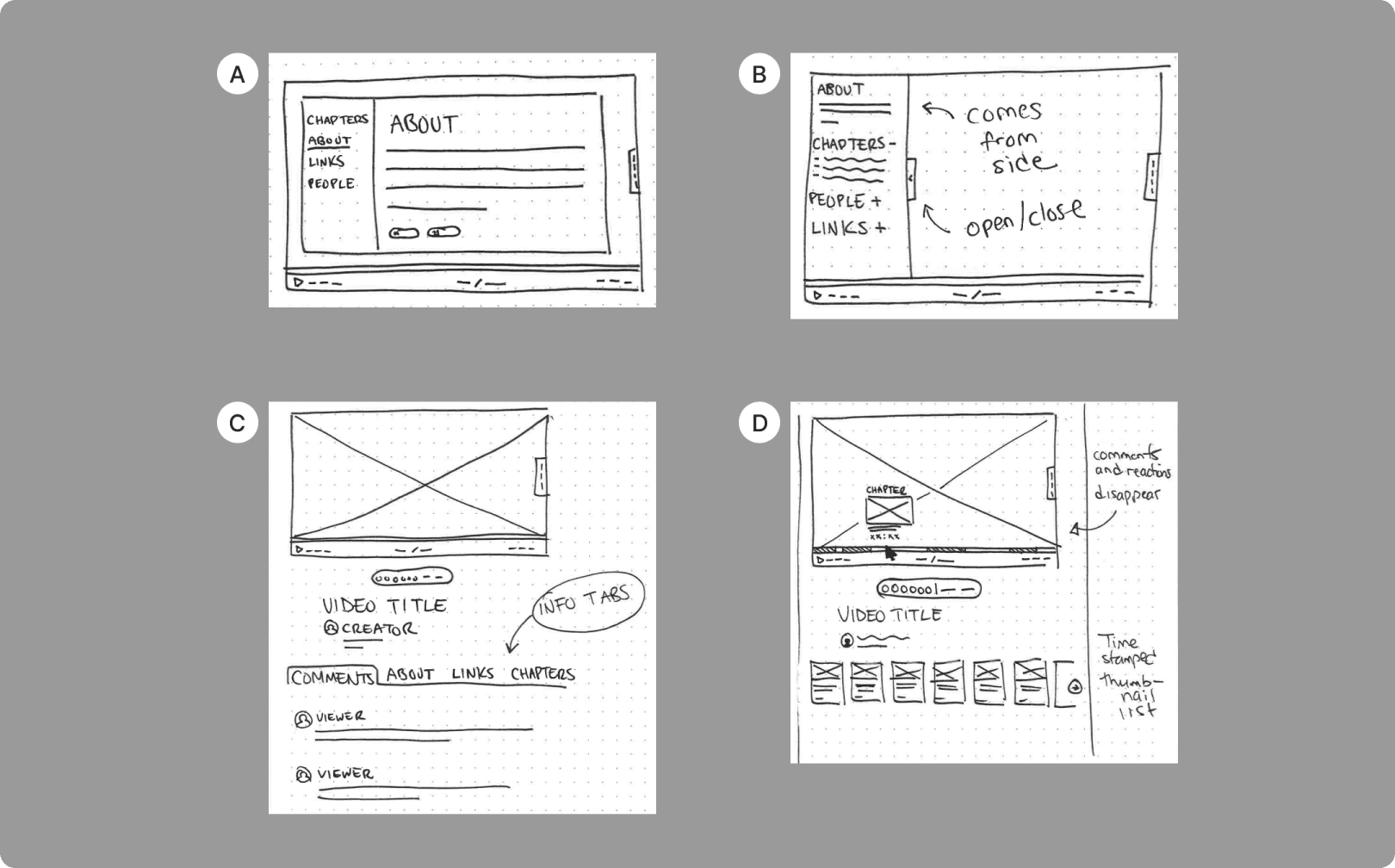
Theme 1: Embrace the video format to emphasize critical info while playback IS in progress.
A. B. C. — “Info hub” in the video frame and beneath the video frame
D. — “Timeline hover preview image” and “chapter cards”

Theme 2: Emphasize critical info while playback ISN'T in progress
E. — “Chapter preview lists” and “chapter cards”
F. — “Slack App chapter list”
Concepts that utilized the chapter feature aligned with the design goal and became wireframes.
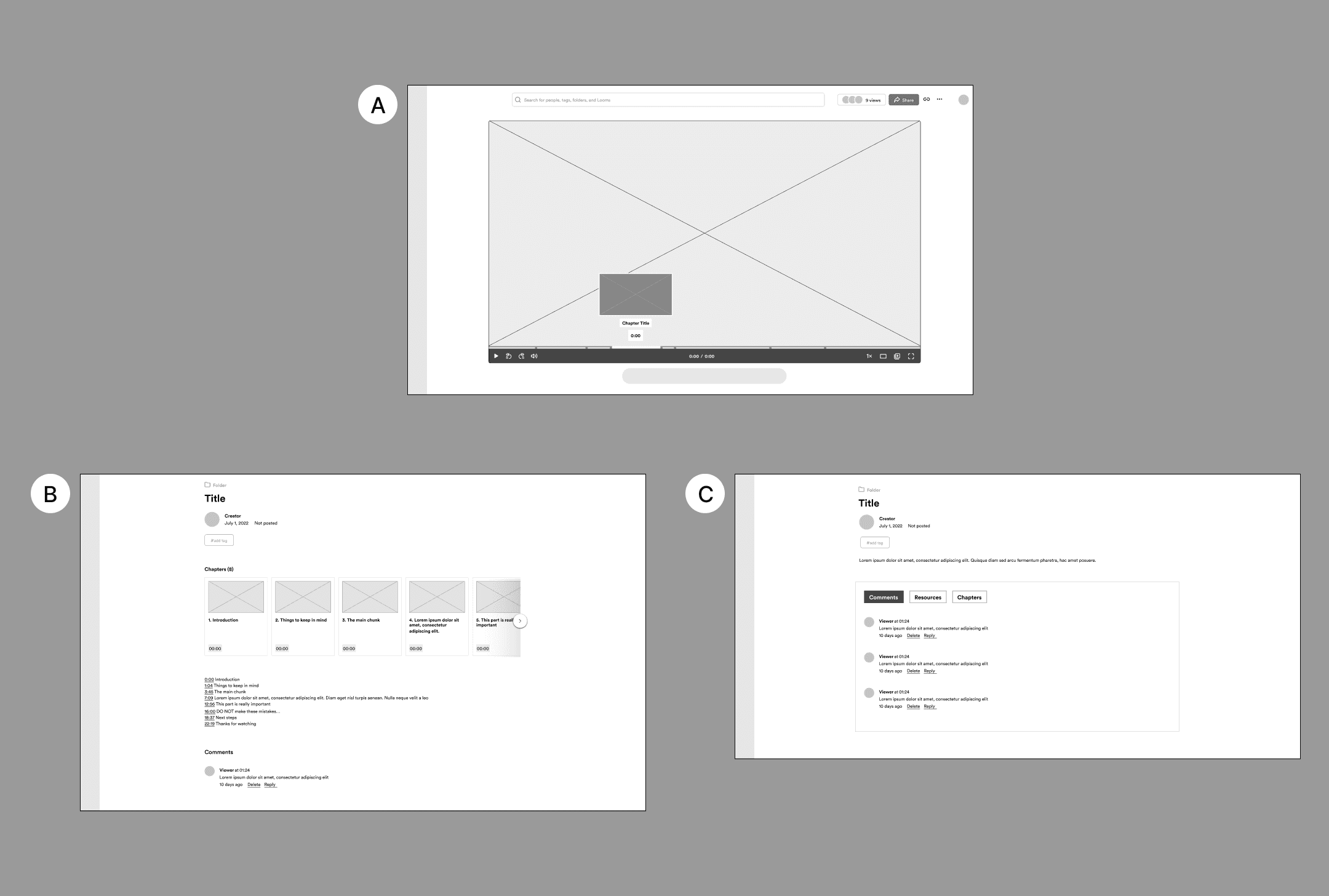
Theme 1: Embrace the video format to emphasize critical info while playback IS in progress.
A. — “Timeline hover preview image”
B. — “Chapter cards”
C. — “Info hub”
Theme 2: Emphasize critical info while playback ISN'T in progress
A. — “Video start options”
B. — “Chapter list”
C. — “Slack app chapter list”
Refinements before high-fidelity mockups.

Before Loom (the actual company) added the “Watch Later” button, its location at the bottom seemed suitable for “View Chapters.”
I invested in finding the proper structure for the chapter list items—I felt chapter numbers were useful to distinguish each in collaboration.
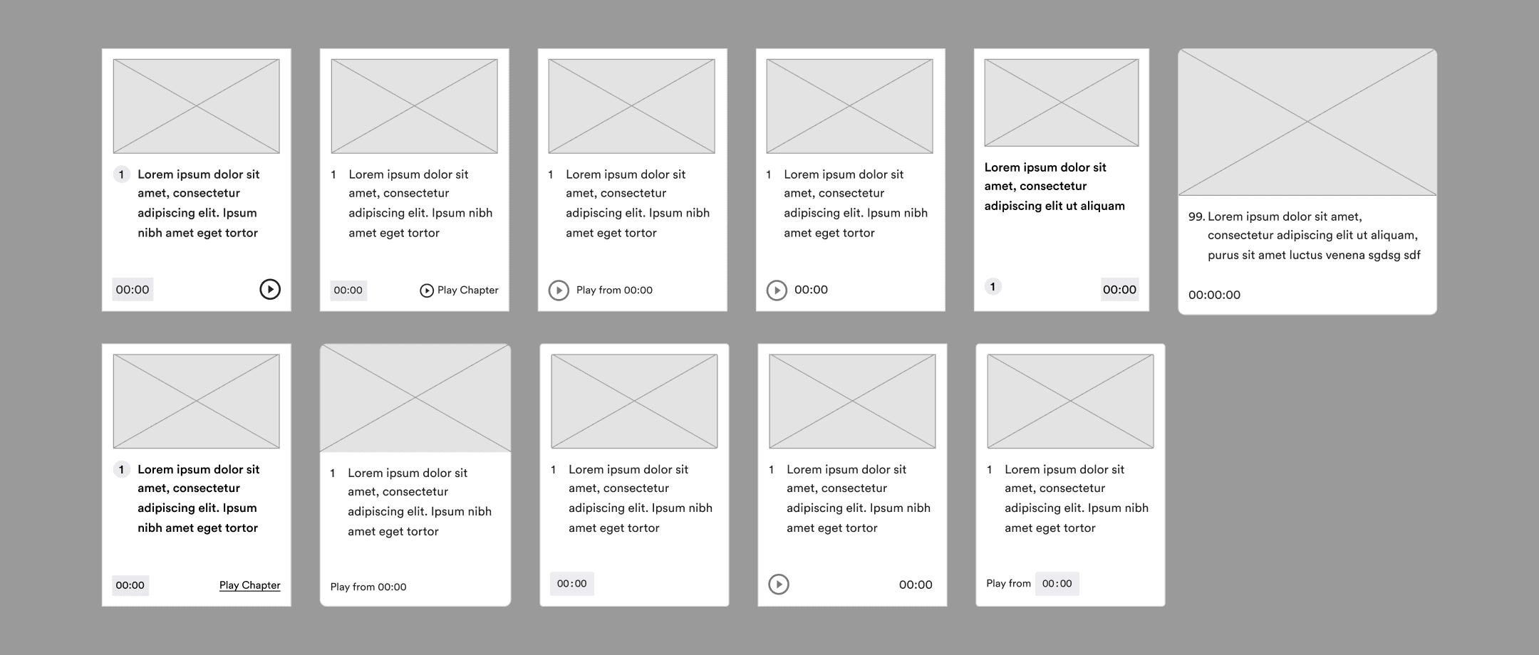
This is where the “chapter cards” concept died. In hindsight, it lasted until this point because of its utility on YouTube video pages.
I attempted to include chapter numbers on the Slack App too. Their removal allowed for longer titles and negative space.
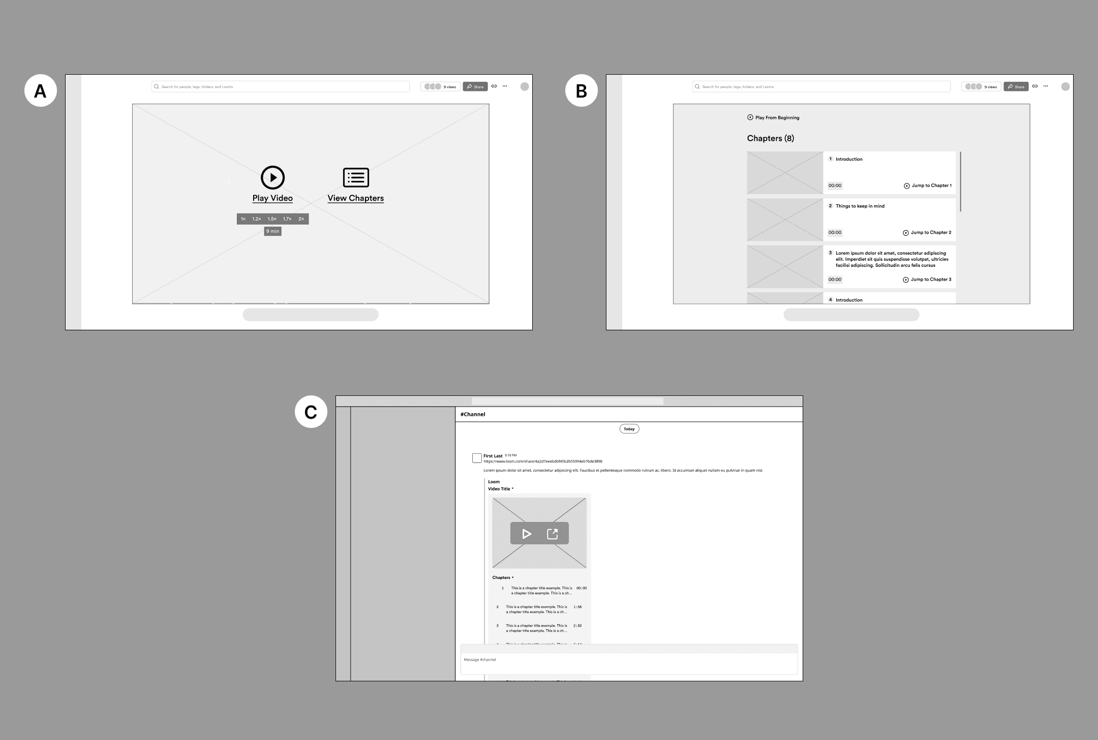
Validation
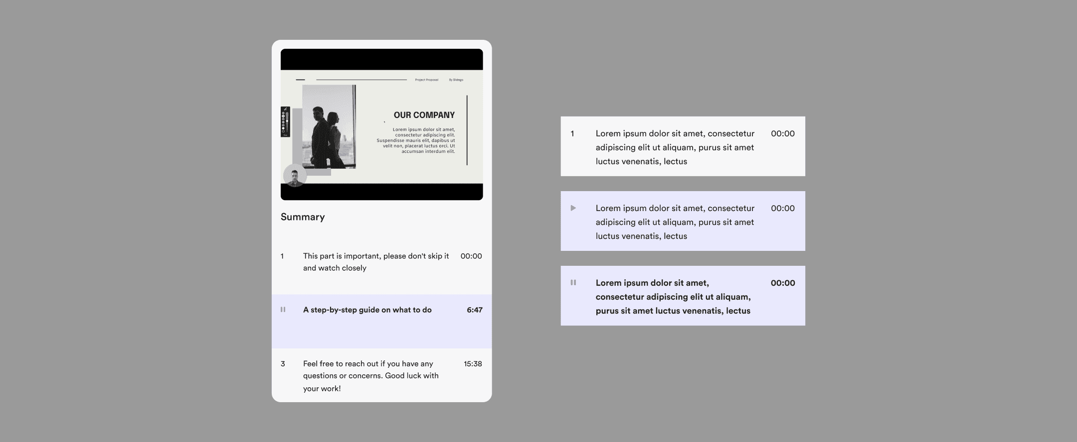
The first designs to be tested.
I felt “View Chapters” should be as pronounced as the other option to convince users of its validity. I pursued a chapter section rather than a chapter tab because I thought it was the more conspicuous option.
Like the Loom web page, I devoted a section after the summary to chapters. The timeline chapter segments' design and hover preview mainly remained unchanged.

Test subjects found the needed information but were inhibited by low placement from seeing the low-placed chapter sections.
The next iteration.
Both chapter sections became tabs for the next version, and the “View Chapters” button became a less central element.
Even though the persistent chapter list on the Loom web page moved behind a tab, it kept its thumbnails and chunky layout. I redesigned the “View Chapters” icon for legibility at a smaller scale.

Test subjects found the web page chapter lists to be overly cumbersome…
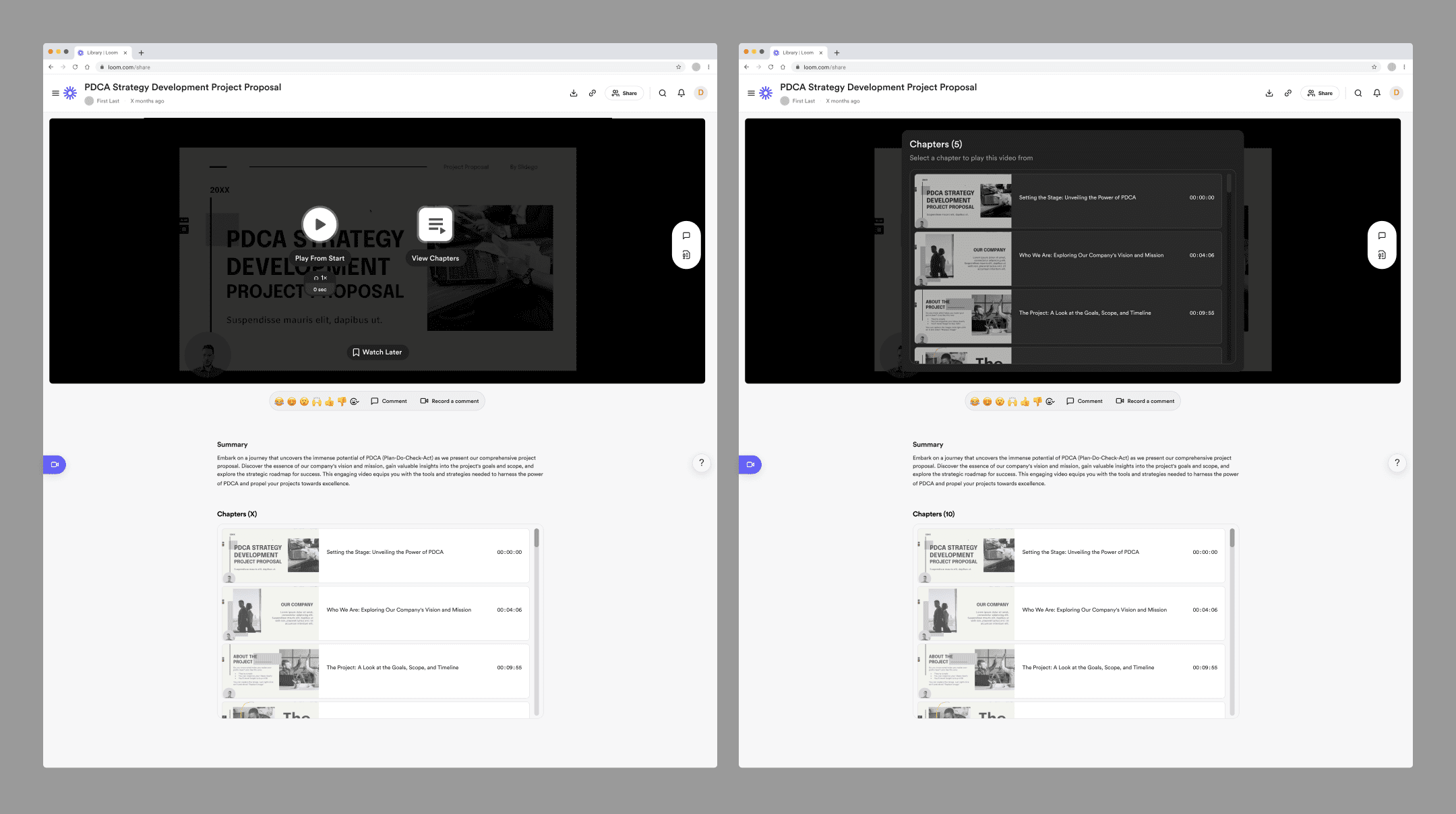
Final Designs
I stuck with the “Summary” text line length that Loom currently uses, even though its size limits its legibility. I predict it’s so long because the view-counter might appear isolated otherwise.
Each chapter’s size decreased in the video frame’s list and the chapters tab’s persistent list shrank for lighter viewing.
The video frame chapter list more intently incentives users to scroll because it reveals more of the fourth list item.
A small font size for chapter titles comfortably allows for descriptions.

The visual design of my update to the Loom Slack App was inspired by Spotify’s Slack App, which uses their product’s aesthetic rather than the standard Slack “Block Kit.”
Conclusion

Enabling viewers meshes their needs with Loom’s mission “to empower everyone at work to communicate more effectively, wherever they are.”
Fulfilling the design goal will improve users’ work performance.
Viewers will have explicit access to video concepts, leading to better knowledge retention.
A more efficient viewer experience will increase overall productivity.
Creators will gain more recognition from viewers for their outputs.
And Loom (the company) will achieve higher revenue from workspace upgrades.
Creators will make more or longer videos, and viewers will ask for more info in Loom form, leading to upgrades.
Users will share more videos and positive sentiments with potential new customers.

These metrics can be used to measure the success of the changes:
User adoption rate.
Frequency of use.
Qualitative user feedback (which I gathered in tests and was broadly positive.)

Looking Forward
If I were to continue, I'd design and gain understand these areas:
I’d design how Loom chapters appear within shared-video emails and Discord messages. These are also common methods of distribution.
I’d visualize how chapters appear within a Loom video’s audio transcription. One user I tested told me she often uses the transcripts, and others online posted they do too.
I’d more deeply understand the Lens design system. Specifically, why Loom sometimes breaks the 4pt baseline grid but adheres to it most of the time.

Learnings
I grew in work ethic, visual design, testing, research, and product thinking.
It’s essential to move quickly. Before I completed this project, Loom had launched a similar version of the chapter feature. It’s a reality of hypothetical work that the product’s real creators might build a comparable thing, but I wish I didn’t need to contend with that. I feel validated that their team identified the same problem space as me and landed in a similar spot.
I must be more intentional to remove my bias while researching and designing. In my user research, I too forcefully skewed some of my questions toward problems people may face when interacting with Loom videos through reactions and comments. As I bridged my wireframes to visual designs, my several attempts to make chapter numbers succeed were in vain.
It would’ve been beneficial to conduct more interviews and tests. If I interviewed more people after I decided to focus on the critical information problem, I would’ve had more evidence to back up my efforts and also arrived at my solutions in a more timely way. I also could’ve gained wisdom by testing Loom’s actual updates to chapters.